1. The Rise of Bold and Vibrant Countertop Colours
1.1 Embracing the Unexpected: Why Bold Choices Matter
In the world of interior design, bold and vibrant colours are no longer relegated to accent pieces or the occasional statement wall. Homeowners and designers alike are embracing the unexpected by incorporating vibrant hues into more permanent fixtures, such as countertops. The shift towards bold colours in countertops reflects a larger desire for individuality and personality in home spaces. Bold choices matter because they create focal points that grab attention and can inspire a cascade of design choices throughout the rest of the home. By integrating striking colours into your countertops, you convey a message of confidence and creativity.
Furthermore, these daring colour choices invite conversations and can serve as a reflection of the homeowner’s journey. Rather than adhering strictly to trends, people are beginning to see their homes as canvases expressing their unique stories. Choosing a vibrant countertop shade like teal or fuchsia can be reminiscent of travels to exotic locales or evoke feelings of joy and energy. Such emotional resonance enhances the design while fostering a deeper connection with one's space.
1.2 Trending Hues of 2024: What’s Making Waves in Design
As we step into 2024, certain colours are emerging as frontrunners in countertop design, capturing the attention of homeowners and designers alike. Earthy tones are making a significant resurgence, with shades like terracotta, olive green, and deep ochre leading the charge. These colours not only mesh well with natural materials but also evoke a sense of calm and grounding, creating spaces that feel both timeless and modern. Such hues work beautifully in kitchens and bathrooms alike, offering a warm and inviting atmosphere.
Additionally, jewel tones are gaining significant traction. Rich emerald greens, sapphire blues, and deep amethyst purples are infusing spaces with a luxurious feel, allowing interiors to exude sophistication and opulence. One of the most appealing aspects of these colours is their versatility; they can be paired with both light and dark cabinetry, seamlessly integrating with various styles from contemporary to classical. With the rising popularity of these tones, the potential for creativity and experimentation is virtually limitless as they can easily be complemented by metallic finishes or contrasting textures.
1.3 Pairing with Purpose: Complementary Colours for a Cohesive Look
Choosing a bold countertop colour isn’t just about the hue itself; it’s equally about how it interacts with the other elements in the space. Complementary colours can elevate your design by creating harmony or contrast, drawing the eye throughout the room. For example, if you select a vibrant coral countertop, pairing it with muted blues or soft greys in cabinetry can enhance the brightness of the coral while maintaining a balanced look. Balance is key in design, and understanding the colour wheel can help in making informed choices.
Moreover, textures and materials play a crucial role in how colour is perceived in a space. When using a bold countertop, consider the finishes of your cabinets and flooring. High-gloss surfaces can amplify the vibrancy of your colour choice, while matte finishes tend to soften bold hues, creating a more understated approach. Lighting also affects colour perception; natural light can bring out the vibrancy of your chosen colours, while artificial light may yield different effects. Therefore, when designing around bold countertops, always consider how different elements will work together in various lighting scenarios for a truly cohesive look.
2. Timeless Neutrals: The Classic Countertop Colour Options
2.1 Shades of Elegance: The Allure of Greige and Warm Whites
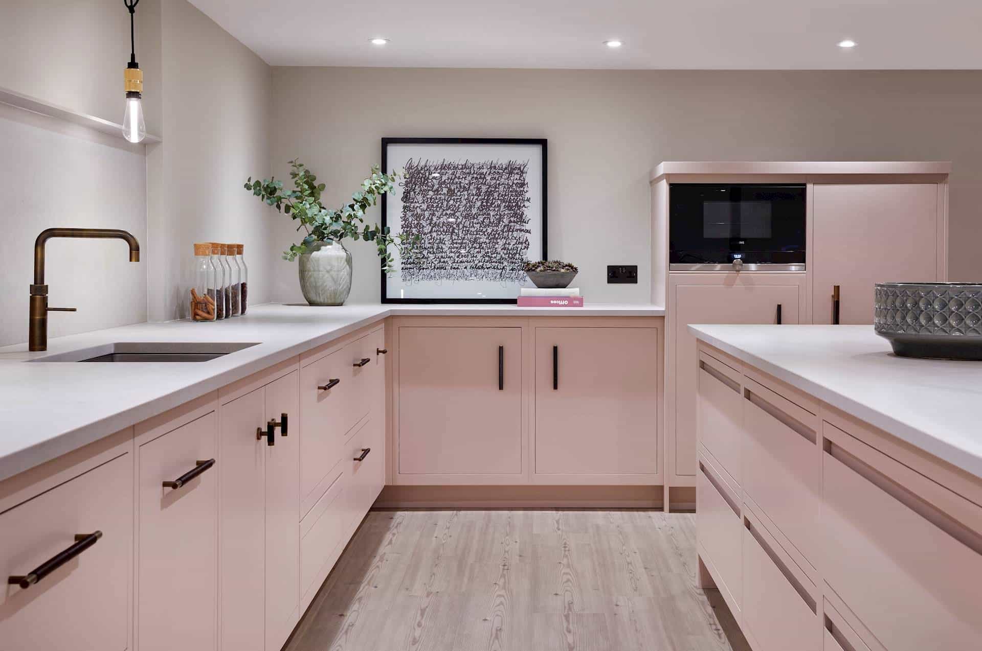
While bold colours have their charm, the allure of timeless neutrals remains undeniable. Among the most popular neutral tones are greige a sophisticated blend of grey and beige and warm whites that radiate calmness and elegance. Greige has become a design favorite due to its versatility; it seamlessly combines elegance with an earthy touch, making it an ideal choice for both contemporary and traditional settings. This colour creates an intimate and cozy atmosphere, especially when paired with wooden or metallic elements, and it continues to stand out among today’s new countertop colour options.
Warm whites, on the other hand, bring brightness without starkness. Unlike cooler whites, warm whites can enhance the ambience of a room, making spaces feel inviting rather than sterile. These shades work particularly well in small spaces, reflecting light and creating an airy feel. Additionally, the beauty of these neutral tones lies in their ability to adapt to changing design trends. Whether you choose to accessorize with the latest colourful decor or maintain a minimalist aesthetic, greige and warm whites act as the perfect backdrop, allowing your space to evolve alongside shifting style preferences.
2.2 Sleek and Chic: Why Black and Charcoal Remain Forever In Style
Black and charcoal countertops exude sophistication and timelessness, elevating any space into a realm of chic elegance. These deep hues are often associated with luxury think high-end restaurants and boutique hotels making them ideal for the discerning homeowner. The inherent adaptability of black or charcoal countertops allows them to complement almost any colour scheme, serving as a dramatic contrast to lighter shades or harmonizing with other dark elements for a moody, cohesive aesthetic.
In addition to their striking appearance, black and charcoal surfaces boast practical advantages, particularly in terms of maintenance. Many dark countertops, especially those made from engineered stone or quartz, are engineered to resist stains and scratches, making them a practical choice for busy kitchens. Moreover, their capacity for showcasing other design features whether it’s vibrant backsplash tiles or the natural beauty of wood cabinetry makes them a worthy investment for those looking to achieve a balanced design while embracing a touch of elegance.
2.3 Undertones that Matter: Choosing Neutrals with Character
When selecting neutral countertop colours, it’s essential to consider the undertones a factor that greatly influences the overall effect of the colour. For instance, a warm white with yellow or peach undertones can create a comforting space, while a cool grey with blue undertones gives a more modern and sleek appearance. Additionally, the nuance of colours can evoke different feelings and atmospheres; choices with warmer undertones tend to appear more inviting, enhancing a cozy, homey feel, while cooler tones bring a crispness that can elevate a sophisticated space.
This attention to detail not only affects aesthetics but also functionality; selecting the right undertones can harmonize your countertop with your existing cabinetry, flooring, and wall colours, impacting how those elements complement or contrast with one another. For example, a warm beige countertop will work beautifully with caramel wood tones, creating a unified look, while a grey-toned surface might clash with creamy cabinetry. Understanding undertones makes the selection process more intentional, leading to a counter space that resonates with your desired design narrative.
3. Material Matters: How Countertop Composition Influences Colour
3.1 Granite vs. Quartz: A Colourful Debate on Durability and Aesthetics
The composition of your countertop material plays a pivotal role in both its colour and durability, sparking lively debates in the realm of home design. Granite, a natural stone, offers a unique richness in colour and texture, with patterns and shades that vary widely from slab to slab. While granite can feature stunning natural hues such as deep greens, rich browns, and even vibrant reds it also requires regular maintenance, such as sealing, to prevent staining and preserve its appearance over time. For many homeowners, the allure of natural granite’s beauty is well worth the effort, especially in spaces designed to be warm and inviting.
On the other hand, quartz countertops have surged in popularity due to their engineered nature, which allows for precise control over appearance and colour. Quartz is manufactured from crushed stone and resins, resulting in a non-porous surface that resists staining and bacterial growth. The colour possibilities with quartz are nearly limitless, allowing homeowners to select from a wide spectrum of shades and patterns, including those that mimic the look of natural stones without the inherent upkeep. For those seeking a combination of aesthetic appeal and practicality, quartz presents a compelling argument, adapting to contemporary trends while offering durability and low maintenance.
3.2 The Eco-Friendly Revolution: Sustainable Options for Colourful Living
As sustainable living becomes increasingly important to consumers, eco-friendly countertop materials are entering the market, marrying aesthetics with environmental responsibility. Recycled glass, bamboo, and reclaimed wood are gaining prominence as sustainable countertop alternatives, allowing homeowners to choose colour in a way that aligns with their values. Recycled glass countertops, for instance, feature vibrant, jewel-toned fragments set in a cement or resin base, creating a stunning visual effect while promoting waste reduction. Such options not only provide an array of colour choices but also tell a story each piece carries a history, transforming recycled materials into beautiful, functional art.
Bamboo, known for its rapid growth and renewable properties, offers a unique earthy colour palette that ranges from deep caramel to soft honey, making it an attractive choice for those aiming for a warm, organic vibe. These materials give homeowners the opportunity to express their style while contributing to a more sustainable future, transforming kitchen and bathroom spaces into environments that reflect both personal aesthetics and environmental awareness.
3.3 Textured Beauty: How Finish and Surface Affect Your Perception of Colour
The finish and surface of your countertop significantly affect how colours are perceived and how they interact with the rest of your décor. A glossy finish can elevate brightness and vibrancy, enhancing the saturation of colours and creating a striking visual impact. For example, a high-gloss black countertop appears more reflective and bold, serving as a statement piece against softer, muted cabinetry. Conversely, a matte finish absorbs light, often creating a softer and more understated appearance that can also bring a sense of warmth to a space.
Moreover, textured surfaces, such as honed or leathered finishes, can add depth and character. A honed finish typically feels more natural and less polished, which can work well with earthy tones and organic materials. These finishes can break up the sameness of a sleek design and add an unexpected tactile element. When selecting countertop finishes, consider how they will interact not just with your chosen colour but also with your existing design elements; texture, finish, and colour combine to influence not only aesthetics but also the sensory experience of your designed space.
4. Integrating Colour with Your Interior Style: A Holistic Approach
4.1 Modern Meets Rustic: Blending Countertop Colours with Design Trends
Design is often about finding balance between different styles, and integrating countertop colours into your overall aesthetic can create exquisite harmony. The juxtaposition of modern elements with rustic influences is a trend that plays out beautifully in the kitchen, where vibrant colours can encapsulate a contemporary vibe while warmer, natural tones can anchor the design. For example, a bold turquoise countertop can pop against warm wood cabinetry, creating a vibrant focal point while allowing the rustic appeal of the wood to shine through. This duality enriches the design narrative, offering layers of visual interest and emotional resonance.
Moreover, integrating textures commonly associated with both modern and rustic styles can enhance the overall composition. For instance, pairing a polished concrete countertop with reclaimed wood cabinetry combines sleek lines with organic forms, resulting in a balanced mix that feels authentic and lively. The key to blending these styles is to focus on complementary colours and finishes; by doing so, you create a harmonious space that resonates with both tranquility and dynamism.
4.2 The Art of Contrast: Using Colour to Create Visual Interest
One of the most effective ways to create visual interest in your home is through contrast, particularly when applying colours to countertops. By juxtaposing light and dark shades, you can achieve a dynamic aesthetic that draws the eye and adds depth to your design. A white countertop paired with deep navy blue cabinets, for instance, not only accentuates the richness of the navy but also helps to prevent the space from feeling flat or monotonous. This technique can work wonders in kitchens and bathrooms, where surfaces and colours meet functionality and beauty.
Using contrast is also about understanding how different colours interact with one another. Cool tones next to warm tones, bright colours against darker shades, or muted palettes alongside vibrant accents can all result in exciting combinations. Considering the overall atmosphere you wish to create is essential; for example, a high-contrast design might evoke modernity and sophistication, while softer contrasts can engender comfort and tranquility. Experimenting with colour in this way allows you to curate a space that not only meets functional needs but also showcases your personal style in a bold new light.
4.3 Personal Touch: How Your Countertop Colour Reflects Your Unique Style
Ultimately, the colour of your countertops should be a reflection of your individual style and preferences an extension of who you are and how you want to experience your home. Whether it’s the vibrant hues that resonate with your creative spirit or the sophisticated neutrals that embody your love for minimalist elegance, your choice of countertop colour is a personal statement. As design trends evolve, it’s crucial to choose colours that make you feel connected to your space and that can transition seamlessly with your lifestyle changes.
Creating a balance between current trends and personal style is essential. Don’t shy away from making bold statements through colour, but consider how that choice will coexist with your existing decor. Incorporating personal elements such as art, textiles, and ceramics that resonate with your chosen colour palette can create a harmonious environment that feels distinctly yours. Ultimately, the choices you make in countertop colours should empower you, enhancing your space and reflecting your journey through life, design, and creativity.


