The use of visual representations to interpret and understand business data is an essential skill for any professional. The advent of digital tools and platforms has made this easier, making data visualization a critical factor in decision-making processes. One of the most commonly used techniques is histogram charts. In this article, we will expound on how a business can optimize its data visualization efforts with a histogram. Keep reading to understand the basics, learn its utility, and even get a detailed guide on building one yourself.
Understanding the Basics of a Histogram
In the business context, histograms are an accessible and straightforward method to represent and understand large amounts of information. They are especially helpful in detecting patterns and trends over time.
Histograms can vary greatly in appearance depending on the scale used, the number of bins, and how the data is spread out. Despite these variations, the core notion behind them is simple - they're graphical representations designed to showcase the distribution of a dataset.
The Utility of Histograms in Business Data Visualization
Alt text: Two coworkers sitting at a conference table while studying a monitor that shows business data on it.
One major use of the histogram is in analyzing patterns in business data, such as identifying trends, peaks or troughs, and outliers. Such information is crucial in guiding decision-making processes. For instance, a spike in customer complaints might indicate a product issue, while a decline could hint at success in customer service efforts.
Frequency is a key term when using histograms, as they display the number of times an event or transaction happens within your business. This makes them ideal for tracking various business activities like sales, performance metrics, or customer interaction.
Collecting and Preparing Data for Your Histogram
Before creating a histogram, quality data collection is integral. Collecting data involves identifying the key business areas to track and the type of information to gather. Such areas could be sales, product performance, and customer engagement. On the other hand, the type of data could be numerical or categorical values.
As a rule of thumb, histograms work best with a large amount of data. This is because they are designed to track frequency and distribution, which becomes more accurate and meaningful with larger data sets. So, ensure your data is comprehensive and representative of the subject you want to analyze.
How To Build a Histogram for Business Data Visualization
Creating a histogram involves simple steps that can be executed in spreadsheet software like Excel or Google Sheets. The first step is to select your data and input it into the spreadsheet. This forms the basis for creating the histogram.
Next is to identify the column that contains the data to visualize. In Excel, for instance, you'll navigate to the "Insert" tab, locate the "Charts" section, and select "Histogram". This prompts Excel to create a histogram based on the selected data.
Finally, it's recommended to include a title and caption that clearly describe what the histogram illustrates. This ensures that any third party viewing the histogram has a clear understanding of the data presented.
Interpreting Histograms for Improved Business Decision Making
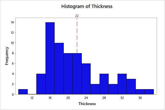
Alt text: A multi-colored histogram with numerous data points that have been plotted out.
The real power of histograms lies in the interpretation of the data they represent. They visualize data distribution, outliers, skewness, and other statistical measures that are valuable in decision-making. Understanding how to interpret these factors can transform your business management practices.
Understanding the peak (height) and spread (width) of the histogram bars can give you an understanding of the frequency and variation in your data. A narrower bar suggests less variation, while a wider bar suggests more. Similarly, taller bars mean higher frequency, while shorter ones mean lower frequency.


